Let’s get the some ideas about visual weight balance as a principle of design, right? So, think about the spaces you love and live. Whether’s it a room in your own home or apartment, or something that get your attention on media, the room probably has a sense of visual balance. When your eye scans it, you can follow a natural rhythm and flow. You pick out pieces that are anchoring the space and others that give it a feeling of openness. Now think about spaces you hate, like the waiting room at the doctor’s office or the boring. Sure, the poor lighting and stark décor don’t do these spaces any favors. But they also feel heavy and, put simply, blah. That’s it, you want to create a space that wows and isn’t at all reminiscent of the dead space. Fortunately, one of the principle of design that we know as a visual weight can help. Let’s take a look at this interior design tool.
The purpose of visual weight, in design, is to balance out how the user will view your page. By properly managing six characteristics of elements, you can achieve balanced visual weight. These characteristics are: color, contrast, lightness/darkness, size, density and complexity.
However, these concepts can be quite subjective in nature. As a designer, you have to use your intuition as to how the users will decipher these characteristics and how the eye will be drawn to, or from, these elements. We can retool the page. We have the technology. We can achieve balance visual weight.
Achieve Visual Weight Balance with Design Elements

Why is visual weight important in interior design?
We’re not just teaching you about visual weight so you can impress your friends at your next party. Visual weight is key and important design principle because it’s a huge part of achieving visual balance. Let’s go back to the rooms you thought about earlier, some you loved and some you hated. A big part of the reason we hate waiting rooms is because they’re filled with low, stocky chairs. There is usually very little to balance out that room (kudos to the people who at least put a potted plant in the corner). The result is a space that feels heavy and tired, where spending time makes you feel heavy and tired.
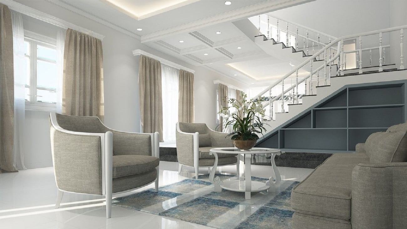
Now think about the rooms you love. They most likely have a good balance of visually heavy and visually light pieces, with plenty of space to let the eye travel between them. Interior designers think about visual weight when putting rooms together so the eye can scan the space comfortably, easily finding anchor pieces while getting relief from items with less visual weight.
What is visual weight balance, exactly?
Visual weight relates to the way an object attracts and interacts with our eye. In short, visual weight is how much your eye thinks a piece weighs. In most cases, this is pretty well tied to its actual weight. Solid wood items look visually heavy and are, in fact, heavy themselves. But visual weight and actual weight don’t always go hand in hand. Take, for example, a couch. If you put it on low, block legs or no legs at all, it will look very visually heavy. If, however, you mount it on taller hairpin legs, you can significantly reduce its visual weight.
This is a big part of why furniture is so important in a room. As some of the largest – if not the largest – pieces in a room, furniture is going to define the visual weight of the space. Too many sturdy, heavy pieces will make the room feel weighed down. Too many lightweight pieces that allow the eye through (like pieces in acrylic or with thin wire framing) and can make the space feel un-established.
What gives an item its visual weight?
You might be wondering how to determine the visual weight of an item. Here are a few factors that affect visual weight:
- Shape: Shapes we’re used to, like squares and rectangles, usually appear heavier than irregular shapes with curves or unexpected angles.
- Size: The larger an item is, the more visually heavy it will appear.
- Color: Lighter items generally appear less heavy than darker ones of the same size and shape.
- Grounding: Items that are close to the ground appear heavier than those that are elevated and allow some light underneath them, like furniture on legs.
- Proximity: A large, heavy-looking item can be made to appear lighter by surrounding it with other objects. When standing alone, its visual weight will be more apparent.
- Texture/Depth: Texture that adds a lot of shadow can make an object seem visually heavier. Similarly, items with more depth look heavier. For example, a deep bookshelf will carry more visual weight than a shallow one of the same size and shape.
How do I use visual weight in my interior design?
As with so much of interior design, using visual weight to your advantage is all about finding balance. Basically, being aware of an individual object’s perceived weight can help you steer clear of issues like stocking a room with too much heavy furniture, making it feel cramped or forgetting to add a visual anchor.
When adding pieces to your room or rearranging the space, take into account the visual weight theory. Imagine your room is on a fulcrum. You don’t want to crowd all your visually heavy items to one side. Distribute them throughout the room and break them up with visually light items and open space.
Balancing your room is the key to creating a space with good design elements. If you’d like to take a deeper dive into this concept, check out our article on how best to achieve visual balance in interior design.
This is Heavy Visual Balance
Once we understand the concept of visual weight, we can understand why certain elements may acquire more attention over others. It’s not necessarily the hierarchy or the negative space that leads the users eyes around the page.
By managing the color, contrast, lightness/darkness, size, density and complexity you have all the necessary tools to build a well-balanced product.
With effective management of elements visual weight you can build a site where the difference is between a clean balanced page and a page with unbalanced and unnecessary attention grabbers.
Complexity Doesn’t Have to be Complex
Characteristic of visual weight, complexity, is quite similar to density. The more complex and varied an element is in its entirety, the more time the users eye will sit on the object, giving it more perceived weight. And to balance the complex element, you need to have a similar watered-down element.
This could be used in the instance of a call to action that has a primary and secondary option. The primary may be your more complex element, where the secondary would be a watered down variation. By doing this, the user would focus on the primary call to action element.
I’m Your Density
Density is a characteristic of visual weight that is a strange beast — a double-edged sword. A more dense and compact element in comparison to a more dispersed element will have the appearance of more weight.
The dual nature of this density comes from trying to balance the characteristic. When dispersing a dense object, in order to balance against another dense object, you may be creating more contrast. In turn, creating another imbalance.
When using dense elements, you have to make sure that you carefully offset and balance the page with a conservatively less dense element, as to not have too much negative space creating such high contrast to pull the user away.
Crux:
I’ve always thought of a frame this way: it’s a flat sheet balanced on one point, which is your subject, in order for the eyes of your audience not to exit the frame – the sheet imbalances itself falls off the subject – all of the other objects must be distributed about the frame just so to be balanced, however, there’s more than one way of creating balance depending on the weight of the masses at your disposal. Even if you’ve never heard the term “visual weight balance” before today, you probably already had a sense that it was important. Did this


[…] interior design, texture is also known as ‘visual weight’, and ultimately, it’s what makes a room ‘pop’. However, texture is often misinterpreted as […]