One of the most important steps in home renovation is defining the color palette. After all, it is the colors of simple houses that determine the decorative style of the environment. A composition of light colors, for example, leaves the decoration clean and bright. A darker environment, with walls in navy blue or marsala, emphasizes the modernity and sophistication of the space.
Therefore, when defining the color palette for each environment, consider which decorative style you want to highlight. This makes it much easier to make the right choice.
If you want a modern environment full of trends, our tip is to choose one of the trendy colors to paint the walls of the house – including the facade – or to compose the furniture and decorations.
For you to stay on top of which are the most fashionable colors, we have gathered here 5 most beautiful colors inspired by MPCHS homes. Check it out and choose the shade that best suits your project.
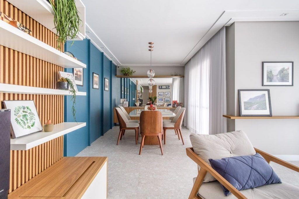
GoUp Architecture
Earth Tones
Earth tones (as the name suggests) are more orange/brown tones, reminiscent of the earth. It is the perfect palette for those who want to have cozy decor and close-to-nature.
Although many relate earthy tones to more rustic decorations, this is not a rule. It is possible to include the shades to compose more modern and minimalist decorations together with neutral tones, such as white or beige. It all depends on the composition you create – and the style of furniture you choose.
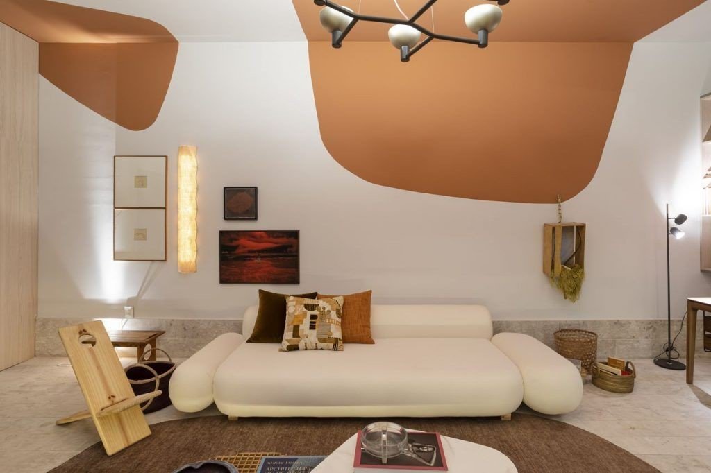
CASACOR SP 2022
Special tip: earthy tones look beautiful as sectored paintings. Try making organic shapes on the living room wall or painting just half a wall in the bedroom to replace the headboard. It’s a way to add a touch of color to your decor without overdoing it.
Shades of Green
Green is the color of hope and nature. Plus, it’s one of the easiest colors to match. It looks beautiful together with pink (for lovers of delicate and feminine decorations). It can be the highlight in its emerald green tone or even compose more cheerful palettes with a mixture of green and yellow.
Including green in the decor is a way to bring nature into the home. You don’t even need to paint the walls with the shade; just investing in the vertical garden or spreading potted plants around the house will be enough to highlight the different shades of green.
Like other colors, green varies from the lightest to the darkest tones, the main ones being:
- Sage green: Softness is the best word to describe this hue. It is slightly grayish, which makes it a more neutral and light shade of green
- Emerald green: Vibrant! The color of the emerald stone is modern and flashy. It is the perfect shade to compose cheerful and fashionista color palettes
- Dark green: this shade is indicated to compose ornaments and details in the decoration, that’s because the dark colors on the walls decrease the space – especially in compact rooms
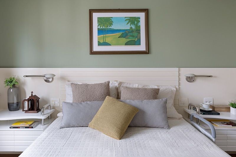
Oliva Architecture
Sand Color
The sand color is a timeless and versatile hue, perfect for adding a soft touch of color to the decor so that the environment remains bright and clean.
It is a great option for painting walls and composing furniture upholstery. The sand couch is wonderful.
Also, the color fits into different color palettes. It can be used in conjunction with earth tones (which are also trending) or with green to highlight nature in the decoration.
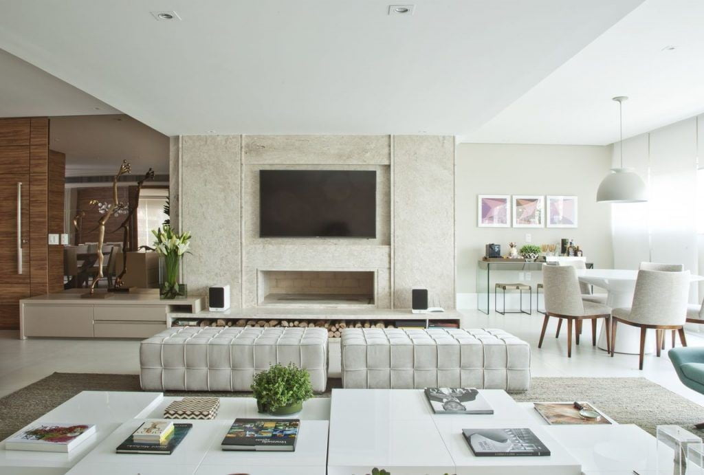
Bianka Mugnatto
Tip: The handmade ornaments made in this shade highlight the comfort and intimacy of the environment. Include crochet blankets, embroidered pillows, and other crafts in your space to emphasize these characteristics.
Shades of Purple
Every year, Pantone chooses a color as “the color of the year”. In 2022, the color of the day was “ Very Peri ”, a shade of purple that conveys joy, creativity, and transformation.
Paint just one wall with the shade or use it to compose the furniture and decorations in the room. The important thing is that the room is decorated the way you like the most.

Inner Space
Soft Pink
Because it is considered a more feminine and delicate color, not everyone likes to include it in their home color palette. But the truth is that pink in lighter and softer tones is super modern and a great color to match other trendy shades like green and light blue.
Even the pastel pink highlights the vintage style with a lot of charm. If you don’t want to invest in it to paint the walls, just use details on the pillows or a pink rug together with shades of gray or black. It is a super modern and harmonious composition.
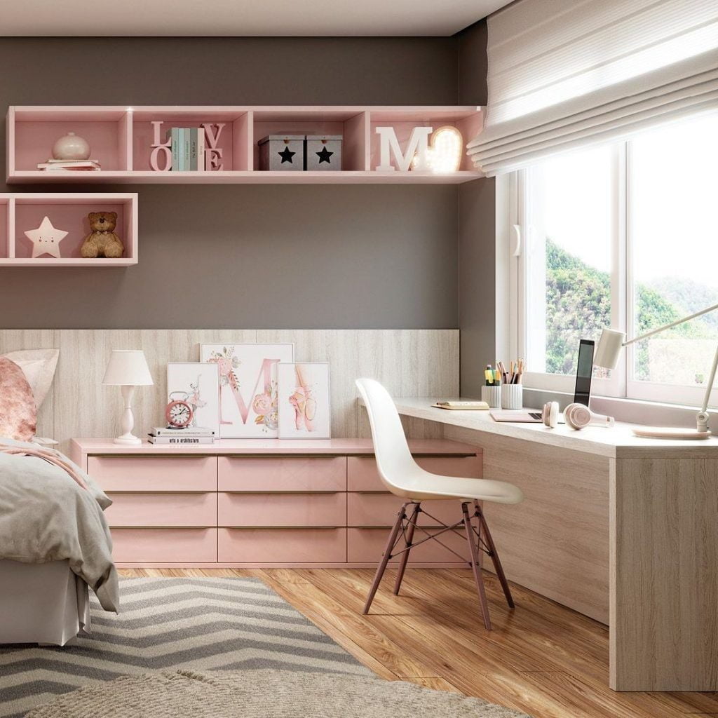
New Móveis Taquara
Were you inspired by these color suggestions? Choose the ones that most catch your attention and match your personality to decorate the rooms in your home. Check out Blue World City if you want ideas on home designs.


